Sometimes the only way to deal with a finish that seems ridiculously complicated is to make it as simple as possible.
This was the job: paint about 45 linear feet of crown molding to match the real marble in a building’s entry vestibule. The crown was complicated, the marble pattern was intricate, and the time frame was limited.
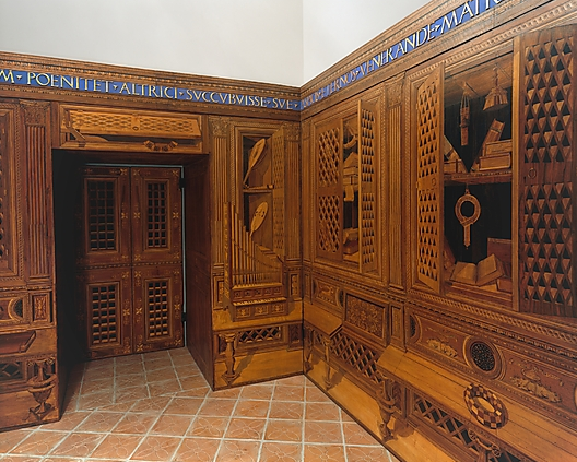
Here’s a portion of the vestibule. Each corner has two marble columns, plus one in the center of the north and south walls. The door frames are solid marble as well. The plaster crown molding has been painted an odd shade of greenish blue.

In this area over the door, you can see the marble more clearly, not to mention the detail of the crown molding’s design. Yikes!

This marble is a doozey. I figured that the only way to match it successfully, unless I wanted to be painting for weeks with a tiny brush, was to replicate the pattern as simply as possible. After a bit of experimentation, I realized that by painting three types of patterns on top of one another, I could match the stone.
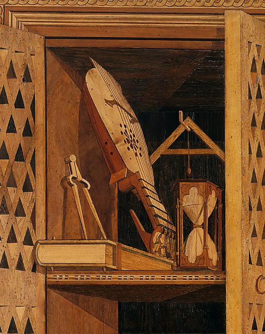
This is a close up of one of the fluted columns.

This is my approved sample board below.
Here you can see how the stone is painted in three types of patterns. In the deep background, a sponge creates the overall muddiness and tone with both slurred and crisp imprints. In the middle ground, veins link portions of the sponging together to create direction. In the foreground, the pattern opens up into pure black holes that seem to create depth by moving between the foreground and background planes. The variation between crisp and soft lines also creates depth and interest.

I documented the progress of the crown above the rear columns on the right side. First step: paint the crown black, then tape off the ceiling and walls.

Naturally, I forgot to take a photo of the first glaze process, the sponging, done in five layers in two shades of dark greenish brown. I used acrylic paints throughout.
Here’s the second glaze process, the veining, completed. Although I did two layers, this went quickly, since the sponge patterns dictate how the veins have to run. The less you think about it, the easier it is. They’re painted in a lighter shade of greenish brown.

Here you can see it at this second stage above a column. It’s a process of building up color, tone and pattern. The more visual depth created, the more successful the illusion.

More layers of veins to bring the color up. You can see below how the brownish color has become too dense. This is intentional; there needs to be enough color to make the next step make sense.

Next, we’ve gone in with small brushes to add black blobs and spots, opening up to the background color. It’s easier to add the background color in again to open up the pattern rather than to try to keep an open pattern throughout the previous seven layers of glaze.

My finish isn’t quite as yellowish as the stone because after I’ve varnished the finish, it will yellow a bit over time.
Here’s the completed area over a center column.

I like jobs like this, where I know that I can solve the problem, but at the beginning, I’m not sure how it will happen. It’s sort of like doing a big jigsaw puzzle: it seems daunting at first, but so satisfying when completed!