• About

This Handcrafted Life

~ decorative painting, low-tech photography and paper craft

This Handcrafted Life

Category Archives: glazing

Designing with Light: Gilding a Wall

02 Wednesday Jul 2014

Posted by ThisHandcraftedLife in Decorative Painting, glazing, Interior Design, Painting before and after

≈ 9 Comments

Tags

aluminum leaf, decorative painting, gilding, glazing, interior design

I’ve been working on my dining nook for a while now, trying to bring it all together. It’s not much of a space: about five feet wide and twelve feet long, basically a glorified hallway between the front and back of the apartment. I decided to gild the wall with aluminum leaf.

Why gild at all? It’s slow, smelly and incredibly messy. Here’s why: because it’s amazing what a difference a reflective surface can make. Plus it’s really fun!

This is the darkest corner of the apartment. It gets eastern light in the morning, and once the sun moves, gloom descends. So I have to put something reflective on the wall to bring in light, and I’m not a big mirror gal. And the wall is a workable size, about 4 feet tall, manageable by myself.

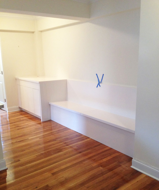
Here’s what I started with, a freshly installed banquette bench with cabinetry and a very white wall.

D:Start

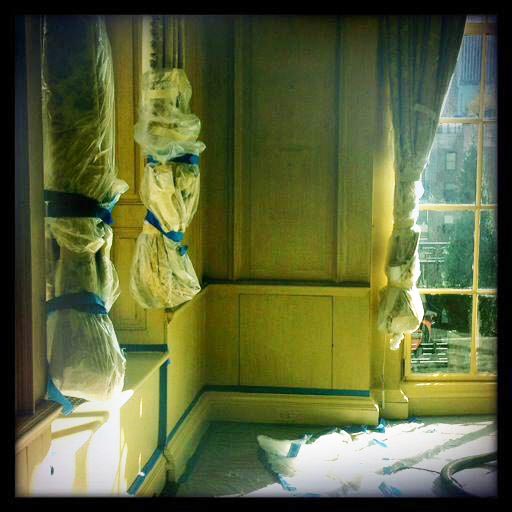
First step, prep: protect everything with plastic, tape out the wall with low-tack tape, then base coat in an oil-based light grey, similar to the tone of the aluminum leaf.

D:Grey

D:GreyStr

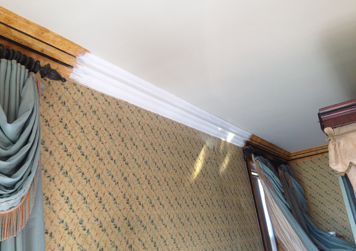
The trickiest part of gilding is staying level and square. Drawing parallel lines on the surface with a sharpie lets me know where the leaf should go. The lines are 6 inches apart because that’s the width of the leaf.

D:Grid

The leaf is stuck to the wall using oil size, a type of glue. The size is rolled on with a regular paint roller, then brushed out with a natural bristle brush. It has to come up to the correct tack before the leaf can be applied, which takes about 90 minutes, depending on how much it’s been diluted. The surface is workable for several hours.

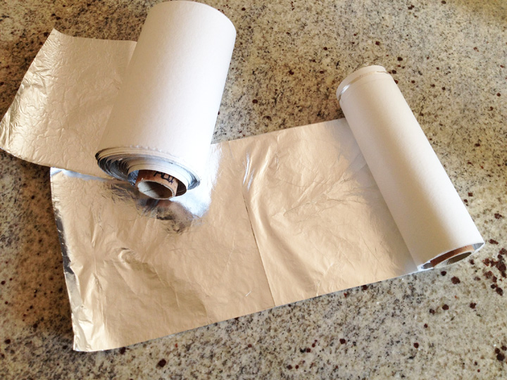
I’m using rolls of ribbon leaf, cut into sections five squares wide. Gilding with individual leaves would take forever; this makes the job much easier and creates better results.

D:Roll

And then it’s time to start gilding, from bottom to top and right to left. From the bottom so leaf doesn’t fall onto the sized surface, and from the right because mistakes will be made at the beginning.

D:StartGild

D:GildMid

D:GildDone

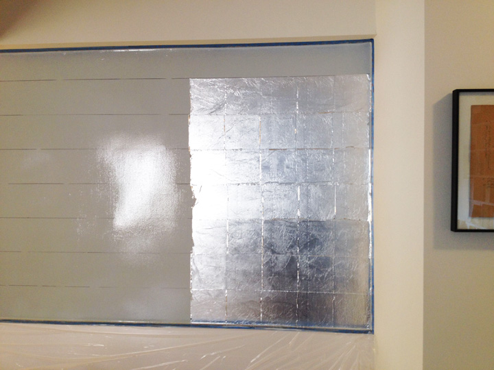
Each leaf overlaps the next one by 1/8 of an inch. So when the wall is done, all of that overlap is fluttering in the breeze.

G:GildClose

Once the wall has dried overnight, the overlap is cleaned off with a soft brush, which creates a huge mess, tiny bits of leaf floating off in all directions. Below is the completed wall. As the photos above progress, you can see the light leaving the room as the morning sun moves to the south.

I turned off the lights to show how much the leaf reflects indirect light.

D:GildClean

So here we are with everything back in place.

D:Roo

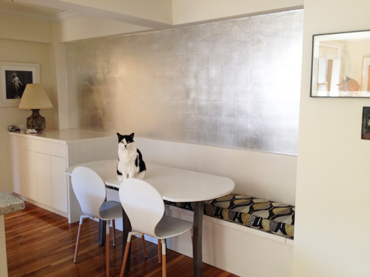
Tons of light, right? And the wall changes as the light changes. What a difference. But I’m not done; aluminum looks very cold and hard, and I don’t want the dining nook to feel chilly. The wall needs an overglaze to knock back the reflection and warm it up.

To coordinate with the green in the bench cushions, I mixed a dirty green. Green is one of those colors that can read as cold or warm, depending on what it’s next to, since it’s a mix of blue and yellow, cold and warm.

D:GlazeColor

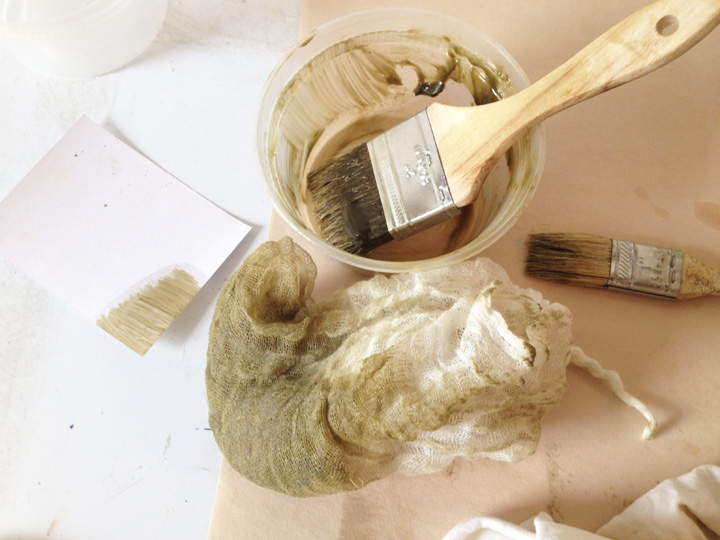
The glaze is made with Windsor and Newton Liquin mixed with tube oil colors. Liquin is an oil-based medium used to speed drying time, and it’s the only medium I know that stays translucent over gilding. The glaze is applied with a chip brush and gently pounced with cheesecloth to give it a bit of texture.

D:OGlazeStart

D:OGlazeMid

Even though the green seems really strong as it goes on, it ends up looking subtle. The refection of the leaf is no longer glaring, although it still softly reflects, the tone is warmer and now the wall is visually integrated with the dining nook’s palette.

A couple of shots of the finished wall with the lights off in the late afternoon. The light from the window across the room now bounces off of the leaf.

GAfter2 GAfter1

And with the lights on.

D:End

Before and after. Still waiting for my light fixture to arrive.

Double

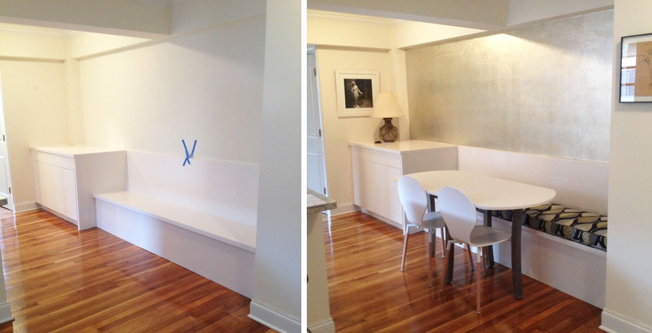
The table is custom made and I love it. That’s a story for another day!

Color Matching Madness

12 Thursday Jun 2014

Posted by ThisHandcraftedLife in Decorative Painting, glazing, Interior Design, painted stone, painted wood grain, Painting before and after

≈ 8 Comments

Tags

color matching, decorative painting, faux finish, interior design, marbling, trompe l'oeil, wood graining

Here’s a quick little post about all of the color matching I’ve been up to these days. I love these projects; some are very challenging and others are pure play. I also end up jumping all over town, which is fun.

We’ll start off on Sutton Place on the East Side with a damaged crown molding in a bedroom. It was originally painted as a faux wood burl. Water damage wiped out a long section over the bed between two windows. Here’s the repaired area, just primed.

Burl1

This is the final finish. It took about five hours to base coat, glaze three times, then paint in the black lines. You can still see the water damage on the fabric-covered wall.

Burl2

Next up are a couple of thermostat heat sensors on the Upper West Side. These are placed on walls and are about 1-1/2 inches wide. They usually stick out like sore thumbs. This first one is painted to match a wall upholstered in a velvet fabric with a recessed pattern in a contrasting color. Tricky.

RedButton

The next one is on a sisal wall covering. The colors look off in the photo, but match in person. The best part of this one was trying to create a three-dimensional trompe l’oeil effect on such a tiny scale.

SisalButton

Below is another wallpaper, a mini tragedy to a home owner on the Upper East Side. The paper was damaged and a new portion was cut in. Unfortunately, the reserve roll didn’t match the paper on the wall. This area is about 4 x 6 inches, between a crown molding and the top of a door frame.

WPaperPatch

I was able to paint it to match by carefully layering on color, but there was no way to hide the cut lines. The client was not happy, but there are some things I can’t do with paint and erasing cut lines is one of them.

WPaperPatch2

Now we’re getting into the really fun stuff. This violet marble is spectacular; it clads every surface in a tiny powder room. For some reason it was really easy to match, a total blast. In case you ever have to match this marble, here’s the skinny: Permanent Violet Dark combined with Red Oxide and Black.

Violet2

Here’s a close up.

Violet1

The same marble was also used in the apartment’s kitchen.

Violet5

Violet4

Just for fun, here’s the view from this apartment’s living room. That’s the Plaza Hotel, perched on the edge of Central Park.

Plaza

And we’ll finish up on the Upper East Side again, in the bar area of a brand new apartment renovation. Usually when I paint outlet covers, I’m asked to leave the center plug section unpainted because the paint will scratch off eventually with a lot of plugs going in and out. In this case, though, the designer asked me to paint the whole thing, and it let me create a vanishing act.

Love this brown travertine marble. Where’s the plug?

Bar1A

Right there, silly.

Bar1B

And the next corner.

Bar2A

And the third corner.

Bar3A

Bar2B

That’s it for now. Happy weekend, everyone!

The Paint Doctor Returns… with a Comb

16 Wednesday Apr 2014

Posted by ThisHandcraftedLife in Decorative Painting, glazing, Interior Design, painted wood grain, painting tools

≈ 8 Comments

Tags

art, decorative painting, faux finish, faux wood grain, interior design, painted oak, painting, tools and techniques, trompe l'oeil

Artists use all kinds of tools to get the effects they want, and decorative painting has its own bag of tricks. I remembered this recently when I had to match up a repaired base board to an existing wall which had been wood grained by someone else using some serious comb work.

This woodgraining is part of a fantastic foyer in a client’s apartment. The entire room is faux woodgrain, done in a unique style I’ve never seen before. The combs have created a relief pattern on the surface, so the painted wood is three dimensional, and when you walk into the room, the walls look exactly like real oak.

Here’s a small section of the wall that was painted by another artist. This is a flat wall. The three-dimensional trompe l’oeil effect of the molding is painted.

FauxOakWall

Here’s a detail. This work is phenomenal. It not only looks like wood, it feels like it, too. The control that the artist had with his combs is impressive. Look at the variations in the colors and how clean and crisp the combing is, with a thin glaze of creamy white on top to knock back the graining and give the effect of whitewashing.

FauxOakClose

There are all sorts of different combs that can be used to create patterns. Below are a few. The big orange comb on the far left is similar to the one that was used to create the pattern in the walls above. It creates graduating lines that mimic real wood.

Some of the other combs: top left are white and red custom combs that I cut at a specific size for a certain job; the triangular comb has three options; the metal combs come in sets at various tooth widths, and the center bottom orange comb has both pointy and straight teeth.

Combs

Below is our patient. A portion of the baseboard has been replaced, and I have to repaint it to match the existing finish. The installers managed to mangle the wall above the baseboard, so that has to be fixed, too. After measuring the comb’s marks, I went home and discovered that I had an almost identical comb. Hooray! If that hadn’t been the case, I would have custom cut a comb to match the pattern.

Base1

We start off with taping, floor protection, patch, sand, prime and base coat. Everything in this process is water-based. Next up, a light glaze to create the correct undertone for the combing.

Base2

Right away, here we go with the comb. The glaze has to be dark to stand out because there are more layers going on top. I also started filling in the damaged area above the base board using small brushes and liquid acrylics.

Base3

The next couple of glaze layers knock back the starkness of the combing while creating an irregular whitewash effect as seen on the rest of the wall.

Base4

And here we are, all matched up. That took about two hours and the help of a blow drier.

Base6

Combs are commonly used when painting oak, since they break up the figure pattern in a realistic way, mimicking the choppy grain. Below is a sample of painted oak with a very strong figure grain. The vertical lines that scratch through the darker figure pattern and side grain are created by pulling a comb through the wet glaze after the figure pattern and side grain have been completed.

Oak

Below is a close up of a European Oak grained door that I’m working on this week. I’m matching this door to the existing wood in a Library. This is the first coat of glaze. The glaze is rolled on, then brushed out with a chip brush. The first comb, a rubber one, has 1/8-inch teeth set 1/8 inch apart. It’s dragged down once, following the curves I’ve created with the brush. This comb is then dragged again at a slightly different angle, which naturally creates moiré patterns. Then a metal comb with much thinner teeth set close together is passed over twice at other slight angles, further breaking down the paint into different organic patterns. This may look complicated, but it’s all done naturally by the combs and perfectly mimics the patterns of the real wood in the rest of the room.

PierreOak

Combs can also be used to create all sorts of pretty patterns that can be glazed onto walls as well. This is a criss-cross combed pattern. First one direction is combed, and after it has dried, the other direction is combed on top. Finishes like this are usually created in muted colors because bright colors would give you a migraine and overwhelm a room. I apologize for all of the beige in this post!

CombedFin1

The example below of a striped combed pattern shows a few of the beautiful effects that combs can produce. The irregularity caused by freehand combing is part of the charm. Sometimes levels are used to create perfectly straight combing, especially on large walls. At which point I say, if you want perfection, use wallpaper!

CombedStripe

The best part about combs is that if you cut your own, the pattern possibilities are endless.

Catching Up

02 Wednesday Apr 2014

Posted by ThisHandcraftedLife in black and white, Decorative Painting, Diana plastic cameras, glazing, Interior Design, Photography

≈ 7 Comments

Tags

decorative painting, diana camera, faux finishes, iphonography, photography

Hi everyone, I’m sorry that I’ve been silent for a few months. Between work, fixing up my new apartment and trying to find photographic inspiration, I was completely distracted. But things are calming down again. So, what’s happened in the meantime?

In January, I traveled to Little Rock, Arkansas for a glazing job. On our last day, we stopped by the Central Arkansas Nature Center. Ironically, almost all of the nature inside was dead and stuffed, and an exhibit about native wildlife attributed the destruction of the great buffalo herds in the 19th century to loss of habitat. Loss of habitat? Not proliferation of bullets? However, we did see a great exhibit of fishing lures. Some were handmade, others not, but all were beautiful and the inventiveness and playfulness of the lure designs was amazing.

Lures

Blizzards started rolling through NYC. This is the view from my new office/studio/guestroom. Hello Fort Tryon Park!

SnowView

With an assistant, I glazed this Park Avenue lobby in various shades of cream.

ParkLobby

It was time to experiment with a new pinhole lens for my Nikon D3000. I tried it for a couple of weeks and I really wanted to like it, but it left me cold. My photos bored me to tears. So much for that.

ColorPin

Next up, tackling the dining area in my new place. In NYC, some apartments have a dining nook, which is basically a glorified hallway leading from here to there, but widened out by a couple of feet to give the illusion that a table, chairs and family of four could somehow wedge themselves into this sorry excuse for a room. I decided to have a cabinet maker build a long banquette bench with storage inside and extra cabinets for even more storage at one end because in a New York apartment, storage is king. The distance from the wall on the right to the countertop on the left is just under seven feet. Here’s the before shot.

DiningBefore

Here’s the after shot. Missing: bench cushions, table, chairs, and wall treatment. I’ll write a separate post about the process with more details once I’ve finished everything up; it will include the most fantastic table ever. It was such fun to design and pull this space together.

DiningAfter

More blizzards. Central Park, lovely in the snow.

Snow4

I glazed and gilded this little cabinet in a client’s entryway.

Cabinet

Thought I’d try shooting in color for a change, so I stuck a roll in a Diana camera and went out for a spin. This is the Little Red Lighthouse at the base of the George Washington Bridge, a few blocks south of my apartment. I love film!

RedLH1

RedLH2

Still shooting with my phone while exploring my new neighborhood. This is the Henry Hudson Bridge, which spans the Harlem River where it meets the Hudson River, connecting Manhattan to the Bronx.

HHBridge

Spent a couple of days matching switch plates to oak and marble.

OakPlate

Bought a film scanner, so I can finally scan my neglected negatives. These photos are from a September 2012 trip to the west coast, the Olympic Peninsula in Washington state, that I’d never printed. When I left my last apartment, I left behind my darkroom, aka the windowless kitchen. I was so tired of setting up and tearing down my darkroom whenever I wanted to print that I hadn’t printed in over a year. Of course, now I miss it and want a darkroom again. I hauled all of the darkroom stuff here, but haven’t quite figured out how to create a darkroom in a place that’s full of windows. Stay tuned on that.

RubyBeachLunch2

RubyBeachRock2

More color matching, this time light caps in a mahogany-paneled ceiling.

MahoganyLight

Did I mention how much it snowed?

Snow3

And last but not least, I started a photo project on my iPhone using the Retro Camera app. Usually when I work in someone’s apartment, there isn’t much to photograph when I’m done, since the rooms are emptied out before I begin and my painted finishes are often subtle. So I thought it would be fun to photograph details of the rooms in progress. Here, all of the drapes are wrapped in plastic for protection, portions of the walls are taped for glazing and the floor protection has been pulled away to tape off the base boards.

WrappedRoom

That sums it up for now. I’ll be back to posting regularly. Thank you for reading and following me!

A Transformation: From Yellow Sienna Marble to Limestone

19 Thursday Dec 2013

Posted by ThisHandcraftedLife in Decorative Painting, glazing, Interior Design, painted stone, Painting before and after, painting tools

≈ 8 Comments

Tags

decorative painting, faux finish, faux marble, interior design, marble

Last week, I drew the parameters of a project I was working on in my sketchbook journal. This week, I’ll follow up with the details.

The task: to paint an old marble fireplace to look like limestone, matching stone that was recently installed in the room.

This is the former fireplace. It’s probably a variation of Yellow Sienna marble.

L:OldFP1

Sorry about the plastic wrap, these are the only photos I have. Here’s a detail.

L:OldFP2

Still, you can see how strong the yellow and brown marble is, and can probably imagine how this sort of fireplace will insistently draw the eye. If the designer decided to keep this fireplace, he’d have to balance its heavy visual weight with the other elements and furniture in the room, and integrate or balance its color palette.

One way to trick the brain into believing that the soon-to-be painted finish is real is to match a stone that’s in the room. In this case, slabs of limestone were installed in the doorways. This is a shot of the stone.

L:Real1

Since the limestone doorways must be passed through to enter the room, our brains will register their stone, then look at the fireplace and assume it’s real, partly because we’ve just seen the real stone, and partly because we expect a fireplace to be made of stone. Our conscious minds won’t be aware of this process.

Here’s the fireplace, now painted bone white, a blank slate. My two samples are sitting on top, but I’ll work off of the real limestone. My work station is set up off to the right.

L:White

The first step, as usual, is to tape off and protect the adjacent surfaces. The base painters, who sprayed on the base coat, had already protected the walls.

Painting most marbles is a process of building up layers of color, which creates visual depth. Marbles can have enormous depth, so generally, the flatter a painted stone looks, the less convincing it will be. That’s why we start with such a light base color, so it can shine up through the translucent layers of darker glaze, creating depth.

Off we go. You’ll see this process from two angles. First, about six or seven layers of acrylic glaze are applied with a damp sponge. The colors are a mix of white, raw umber and raw sienna, with a little black. Here’s the progress of the right-hand column.

L:Col:1Glaze

L:Col2

Now, the side of the right-hand column. The colors gradually build up, but the base coat needs to show through as well.

L:Side:1

L:Side2

Off to a good start. That took a day. Here’s where we stand:

L:Whole3

Next up, the detail work that will pull the patterns together and punch up the depth. Out goes the sponge and in comes a little brush. It’s time to link up the patterns of the sponge to create direction and flow. We’re going from general to specific. This will make the stone come to life and will take the better part of a second day.

The blobs are painted with the darkest color that will be used and softened with a badger brush. Then, using a toothbrush, I spatter on the same dark color and a light cream.

L:Col3

L:Side3

Then on top of the dark blobs and the spatter comes the lightest color, a fine web of creamy lines gently pounced on with a barely damp sponge, its patterns joined together with a fine brush. With the darkest and lightest colors right on top of one another, here comes the depth I’ve been working toward.

L:ColFinal

A coat of matte varnish, and the final result.

L:FinalFP

It’s hard to see the details of the painted surface in a photo, but it’s easy to see how the mood of the room has completely changed because the stone has changed. We’ve gone from loud to subtle, from old-fashioned to contemporary (well, as contemporary as you can get with columns), and most importantly, we’ve changed the color palette, integrating the fireplace into the room’s new design. Also, we can see the details of the columns caps more clearly, now that they aren’t dominated by the marble’s pattern.

Magic? Not quite. But almost as much fun!

L:Double

Sketchbook Journal: On the Job

11 Wednesday Dec 2013

Posted by ThisHandcraftedLife in Decorative Painting, glazing, painted stone, Sketchbook Journal

≈ 6 Comments

Tags

art, faux finish, faux marble, interior design, limestone, marble, sketchbook

Task

Tools

Target

Hiding in Plain Sight: Urban Camouflage

18 Wednesday Sep 2013

Posted by ThisHandcraftedLife in Decorative Painting, glazing, painted stone, Painting before and after

≈ 7 Comments

Tags

art, camouflage, decorative painting, faux brick, faux finish, interior design, painting, trompe l'oeil

When I was a kid, I loved looking at books about animals and nature. Some of my favorites contained photos of animals that blended in with their surroundings, like caterpillars who looked like sticks or moths who resembled tree bark or grasshoppers who matched the colors of rocks (like this little dude below).

Grasshopper

Some of the color matching projects I do remind me of those books. Here’s a fun job that I completed last week, painting a metal contraption in an exterior courtyard to blend in with the brick wall behind it.

Brick1

This metal pole supports heat sensors used for a mysterious purpose that I was unable to decipher. Anyway, I used the strongest primer I had to be sure that the paint would stick, and tinted it with universal tints to create each color. Every layer had to be as strong as possible, so only primer was used. First task, taping off and painting the metal to match the color of the brick’s grout.

Brick2

Then it was time to play, bouncing around between the bricks, matching by mixing in venetian red, burnt sienna, raw umber, raw sienna and black.

Brick3

Brick4

Each brick had three or four layers of paint, pounced on to create texture. I used a smaller brush to define the edges of each brick, and by lunch time, I’d finished the support. Off came the tape!

Brick5

Brick6

Brick7

After lunch, I painted the horizontal box at the top of the pole, then promptly ran out of juice in my phone and couldn’t take the final photo. Everything was sealed with an oil-based varnish while crossing my fingers. I can’t guarantee that anything outside will survive winter without cracking, but I try to reduce the chances.

To me, the most interesting thing here isn’t the painting, but that this Park Avenue building asked me to do this. The sensor unit is in an unused courtyard, 25 feet back from the street, around the corner from the entrance. This cosmetic fix was done simply to create the illusion of an unbroken brick facade. No detail too small!

To continue the theme, here are a couple of outlet and switch plate covers I completed this year. Painting these covers to match their backgrounds is one of those final touches that makes a room look integrated and perfectly done. This outlet cover is painted to match granite, one of five in this kitchen.

GraniteSwitch

This switch plate is on a wall of bleached and stained oak. I think of these kinds of painting days as mental health days, because although it looks difficult to match wood and stone, it isn’t that hard and is actually relaxing, since I become completely absorbed as I paint each plate. Regardless, almost anyone who sees what I’m doing is impressed that I can match and I’m showered with compliments all day. Not a bad job if you can get it!

OakSwitch

One of my all-time favorite types of camouflage is body paint. Once I have my files out of storage, it will be time for a feature on the legendary Veruschka, bearer of body paint extraordinaire. Here’s a preview, in keeping with our urban theme. Do you see her? Incredible!

VeruschkaBrick

Matching Marble: From Complex to Simple

31 Wednesday Jul 2013

Posted by ThisHandcraftedLife in Decorative Painting, glazing, painted stone, Painting before and after

≈ 4 Comments

Tags

faux finish, faux marble, interior design, marble, painted stone

Sometimes the only way to deal with a finish that seems ridiculously complicated is to make it as simple as possible.

This was the job: paint about 45 linear feet of crown molding to match the real marble in a building’s entry vestibule. The crown was complicated, the marble pattern was intricate, and the time frame was limited.

Here’s a portion of the vestibule. Each corner has two marble columns, plus one in the center of the north and south walls. The door frames are solid marble as well. The plaster crown molding has been painted an odd shade of greenish blue.

MCornerLFull

In this area over the door, you can see the marble more clearly, not to mention the detail of the crown molding’s design. Yikes!

MCrownOverDoor

This marble is a doozey. I figured that the only way to match it successfully, unless I wanted to be painting for weeks with a tiny brush, was to replicate the pattern as simply as possible. After a bit of experimentation, I realized that by painting three types of patterns on top of one another, I could match the stone.

This is a close up of one of the fluted columns.

M:Column

This is my approved sample board below.

Here you can see how the stone is painted in three types of patterns. In the deep background, a sponge creates the overall muddiness and tone with both slurred and crisp imprints. In the middle ground, veins link portions of the sponging together to create direction. In the foreground, the pattern opens up into pure black holes that seem to create depth by moving between the foreground and background planes. The variation between crisp and soft lines also creates depth and interest.

MarbleCrown

I documented the progress of the crown above the rear columns on the right side. First step: paint the crown black, then tape off the ceiling and walls.

MCornerR2

Naturally, I forgot to take a photo of the first glaze process, the sponging, done in five layers in two shades of dark greenish brown. I used acrylic paints throughout.

Here’s the second glaze process, the veining, completed. Although I did two layers, this went quickly, since the sponge patterns dictate how the veins have to run. The less you think about it, the easier it is. They’re painted in a lighter shade of greenish brown.

MCornerR3

Here you can see it at this second stage above a column. It’s a process of building up color, tone and pattern. The more visual depth created, the more successful the illusion.

MCenterCol1

More layers of veins to bring the color up. You can see below how the brownish color has become too dense. This is intentional; there needs to be enough color to make the next step make sense.

MCornerR4

Next, we’ve gone in with small brushes to add black blobs and spots, opening up to the background color. It’s easier to add the background color in again to open up the pattern rather than to try to keep an open pattern throughout the previous seven layers of glaze.

MCornerR5

My finish isn’t quite as yellowish as the stone because after I’ve varnished the finish, it will yellow a bit over time.

Here’s the completed area over a center column.

MCenterCol2

I like jobs like this, where I know that I can solve the problem, but at the beginning, I’m not sure how it will happen. It’s sort of like doing a big jigsaw puzzle: it seems daunting at first, but so satisfying when completed!

Finding the Balance Between Control and Chaos

21 Sunday Apr 2013

Posted by ThisHandcraftedLife in Decorative Painting, glazing, Interior Design, painted stone

≈ 9 Comments

Tags

decorative painting, faux finish, glass, interior design, marble, painted glass, vgb

Sometimes I like to think that with fourteen years of experience, there’s no project I haven’t done. And then one of my clients comes along and proves me wrong.

One of my favorite clients is a designer I’ve worked with for over ten years. He likes to invent finishes. He’ll say things like, “I’d like a finish that looks like light rain falling on a pond,” and send me off to solve it. After a bunch of experiments guided by suggestions like, “A little more rainy” or “Have you tried flatting oil?” I’ll figure it out and before you know it, a room will have a finish that looks like raindrops.

Recently he asked me to paint a large glass table top, about seven feet by four feet, to look like marble. “Well, that sounds like fun,” I said, “but you know, I’ve actually never painted on glass.” His reply? “Really? Well, I’m sure you’ll figure it out.” There’s a lot to be said for the motivating force of someone who thinks you can do anything.

After a series of experiments, I did figure it out.

GC4

The interesting thing about these jobs is that two things are discovered: new painting materials or techniques and fresh knowledge about the bigger picture. So besides learning that Martha Stewart has a great line of glass paint in a gorgeous palette of colors, the job became a lesson in finding the balance between exerting too much control and not enough.

The glass was set up on a large table in my client’s office, supported by small blocks of stone wrapped in rags to lift it off the table a bit. Below, I’ve started the main veining. I drew it out on a piece of paper first, then jumped right in.

G1

I’m painting what will become the underside of the tabletop. The painted surface can’t be the tabletop; it would look bumpy and strange and could be scratched, so when the painting is completed, the glass is flipped over, the pattern shows through from beneath, and the tabletop’s surface is clean glass.

Because of this, whatever is painted first is on the uppermost layer when the glass is flipped over. This means I’m painting backwards. Instead of working from the background to the foreground, the usual marble painting method, I’m doing the opposite.

This is the view from the other side. The approved sample is in the foreground.

G2

Any material used to make art has it characteristics; it behaves in a certain way depending on factors like viscosity, the substrate it’s applied to, the tool used to manipulate it, the solvent, and so on. One of the surest ways to become proficient at an art or craft is to understand materials and how they behave. This will allow you to create conditions that will help materials fully express themselves to their greatest potential.

Below, I’ve built up the first layer of paint. The thick glass makes everything look green; the palette was white and taupe with a touch of pale steel blue used as accents.

G5

While experimenting, I learned that the best results would emerge if I guided the paint using certain tools, but then stepped away to let the paint settle as it pleased to create its natural patterns. I couldn’t step away too soon, though, or I’d end up with a chaotic mess. The paint needed to be controlled, but only to a point.

By the end of the first day, I’d covered the entire surface with veining.

G4

Depending on its viscosity, acrylic paint will pool, separate and dry in a particular way. I saw that if I created the right conditions, the paint did most of the work, I just had to guide it. The challenge wasn’t painting on glass, it was letting go of trying to completely control the result. The more relaxed and loose I was, the better the outcome. This made it easy to get into that sweet spot of flow, where time disappears and it’s just a day of playing with paint, letting things happen almost on their own, everything coming together like magic.

The second day was spent like the first, building up the paint to total coverage, since leaving unpainted glass would allow you to see through it, which would spoil the illusion of stone. Below is the completed finish.

G7

G8

G9

Here’s a close up. The colors aren’t accurate, but you can see the patterns.

GC2

And a tighter closeup of the same area.

GC1

Once it was dry, the surface was varnished for protection. If I ever get the promised photo of the tabletop in place in its new home, I’ll post it.

The moral of the story? Know your materials, know your own nature, and learn to recognize when it’s time to either take charge or get out of the way.

How Do They Do That? Painted Woodgrain

07 Sunday Apr 2013

Posted by ThisHandcraftedLife in Decorative Painting, glazing, painted wood grain, painting tools

≈ 19 Comments

Tags

decorative painting, faux finish, faux woodgrain, interior design, mahogany, oak, rosewood, woodgrain

Apartment doors in New York City have to meet two criteria: they must be fireproof and self closing. A fireproof door can be either a kalamein door, which is wood wrapped in steel, or a hollow core steel door, which is found in newer construction. So no matter where you live, whether on Fifth Avenue or in a tenement building, your front door is made of steel.

What does this have to do with painting wood, you ask? Lots! If you own a gorgeous apartment and your foyer is paneled in mahogany and furnished with all sorts of swanky stuff and your front door is ugly old steel, what do you do? You paint your door to look like the wood in the rest of your foyer, that’s what.

This door has been painted to look like mahogany. The molding is painted as well, to create a 3-D, or trompe l’oeil, effect.

TrompeDoor

Painting doors as wood grain is one of my favorite projects, and has always been a steady source of work. No matter how much design trends come and go, a front door that’s made of wood (or appears to be) is always beautiful.

This door matches the simple wood closet doors in this entry foyer.

FB:Remo

Painting wood seems complicated, but it’s actually not. It’s about two basic things, pattern and color, and once you understand how to see wood in this way, you can imitate almost any wood.

Most woods can be broken down into three layers: the flogging layer, which represents the pore structure, which are the tiny dots that are found in almost every wood; the figure grain, which is the pattern created by the sap; and the toning layer, which is the overall color of the wood. Each layer has a different color and pattern. Therefore, if you can look at the real wood you’re matching and can recognize and visually separate the color and pattern of each of these layers, you can paint them. And if you’ve seen it all correctly, when the layers combine, voila! Wood. Obviously this takes a bit of practice, but once you get it, you’ve got it.

FB:Maple

In this working sample, each layer was taped off after completion, so you can see how layers and color build up to create a pattern. In this sample, a fourth layer called the crossfire layer was added. Notice the color of the base coat in relation to the final result. The base coat is always lighter than the final finish while tilting toward the wood’s deepest color. Most woods receive a final coat of varnish as well.

FB:Progression

Each layer uses different brushes to create a specific pattern. Here’s a quick sequence of the process of painting a dark straight grain mahogany. I paint wood grain using water-based glaze.

The sample board is painted in a terra cotta colored latex base coat.

FB:S1

The glaze is applied with the chip brush on the right, then flogged with the flogging brush on the left.

FB:S2

The dried flogging layer.

FB:S3

Next, the figure layer glaze is applied. In this case, the figure is a straight grain, so it’s a simple downward drag of the chip brush on the right. The pattern is softened with the badger brush on the left.

FB:S4

Here’s a close up.

FB:S6

The layer needs to dry before continuing. Finally, the overglaze of the toning layer. This is a dark one. The base coat is much lighter so that there’s contrast between the colors, which helps the wood gain depth. The overglaze is applied with a soft spalter brush.

FB:S7

Again, the glaze is softened with the badger brush.

FB:S8

Once the glaze is dry, the surface is varnished with an oil-based satin varnish for more depth and protection.

Here’s another straight grain mahogany in a redder version.

FB-MahoganyPlain

This is a sample of a browner mahogany figure grain.

FB:Mahog

This wood is anigre. It’s painted with the fourth layer of crossfire over the toning layer.

FB:Anigre2

This is a close up of painted rosewood. I love this wood, it’s so pretty. You can clearly see the specks of the pore structure here.

FB:Rosewood

Wood doors are almost always painted to match other wood in the room and because of this, they are often assumed to be real. Sometimes faux wood molding is painted on as well, as shown in the first photo. Painted wood grain will almost always be mistaken for real wood if it’s painted where one would expect to find real wood. If you’d like to learn more about our lazy brains, it’s explained here in my post about trompe l’oeil.

This is an interior door made of wood. Unfortunately, it was made of the wrong type of wood. I painted it to match the surrounding oak cabinetry of the bathroom. Here you see the completed pore and figure layers.

FB:Oak1

Here the door is complete, with the final toning layer and varnish.

RB:Oak2

This is a close up of painted oak.

FB:Oak

If you live in an elevator building, the elevator doors are made of steel, too. If you’re lucky enough to have an elevator that opens directly into your apartment, then you may want those doors to match your foyer or entry vestibule as well.

The real wood door is on the left; the painted elevator doors, with faux moldings, on the right.

FB:ElevDoors

So the next time you’re in New York, standing in front of an elevator door or an apartment door and you think you’re looking at real wood, look again… you may be wrong!

← Older posts

Enter your email address to follow this blog and receive notifications of new posts by email.

Join 330 other followers

Come Join the Gang!

  • RSS - Posts
  • RSS - Comments

Recent Posts

  • Designing with Light: Gilding a Wall
  • Finding an Old Growth Forest in Manhattan
  • Color Matching Madness
  • Meandering Around Munich
  • Sketchbook: Why Cats Seem Indifferent

Top Posts & Pages

  • Inside Central Park: The Arcade at Bethesda Terrace
  • Paper Crafting with Italian Florentine Papers
  • How Do They Do That? Chinoiserie Wallpaper
  • How Do They Do That? Painted Woodgrain
  • How Do They Do That? Painted Strié Finishes

My Decorative Painting Website

Handmade Paper Craft in my Etsy shop

Tags

aluminum leaf architecture art Australia beach birds black and white black and white photography cat central park cityscape color matching craft crafting decorative painting decorative paper decorative papers diana camera drawing embroidery family history faux finish faux finishes faux finishing faux marble faux oak faux painting faux wood faux wood grain fine art florence food gardens gilding glazing handmade book handmade paper illustration interior design italy landscape long island manhattan marble marbling murals nature needlework new york new york city oak painted finishes painted marble painted oak painted wood painting paper craft photography pinhole pinhole camera pinhole photography plastic camera portrait portraiture sculpture sewing silkscreen sketch sketchbook strie sydney toy camera travel trompe l'oeil woodgraining

Categories

Archives

  • July 2014
  • June 2014
  • May 2014
  • April 2014
  • December 2013
  • November 2013
  • October 2013
  • September 2013
  • August 2013
  • July 2013
  • June 2013
  • May 2013
  • April 2013
  • March 2013
  • February 2013
  • January 2013
  • December 2012
  • November 2012
  • October 2012
  • September 2012
  • August 2012
  • July 2012
  • June 2012
  • May 2012
  • April 2012
Online Marketing
Add blog to our blog directory.

Create a free website or blog at WordPress.com.

Privacy & Cookies: This site uses cookies. By continuing to use this website, you agree to their use.
To find out more, including how to control cookies, see here: Cookie Policy
  • Follow Following
    • This Handcrafted Life
    • Join 330 other followers
    • Already have a WordPress.com account? Log in now.
    • This Handcrafted Life
    • Customize
    • Follow Following
    • Sign up
    • Log in
    • Report this content
    • View site in Reader
    • Manage subscriptions
    • Collapse this bar
 

Loading Comments...